
A styled shelf looks effortless and is almost entirely the result of a few repeatable decisions: what to group, what to lean, what to leave out, and where to let the eye rest. The shelves that look best in photographs are rarely the fullest ones.
Whether you are working with a built-in bookcase, a floating shelf or a rental-friendly unit, the principles are the same. Start with structure, then add personality, then take something away.
Start with books as structure
Books are the backbone of a good shelf. They give weight, colour and height, and they make a room look inhabited. Group them in small stacks or vertical runs rather than packing a whole shelf edge to edge. A stack of four or five books with an object on top is one of the most reliable compositions in interior styling.
If the book spines are visually noisy, turn a few stacks spine-inward or remove the dust jackets. Keep the books you actually like — a shelf of untouched coffee-table books reads as decoration, not personality. Mixing worn paperbacks with a few hardbacks looks more natural than a shelf of identical spines.
Do not be afraid to leave gaps between groups of books. A shelf that is 80 percent full looks curated; a shelf that is 100 percent full looks like storage.
The rule of three
Objects grouped in odd numbers feel more natural than pairs. Three is the classic number: a tall object, a medium object and a small one. Vary the height so the group has a silhouette rather than a flat top. Vary the material too — wood, ceramic, glass — so the eye has something to move between.
The rule is a starting point, not a law. Five objects can work if two of them are part of the same functional group, such as a set of candles. The underlying principle is contrast: if everything is the same height, scale or colour, the group disappears.
A useful way to build a group is to choose one anchor object — a vase, a framed print, a sculpture — and then add two supporting pieces that are smaller and quieter. The anchor does not have to be expensive; it just has to have a clear shape.
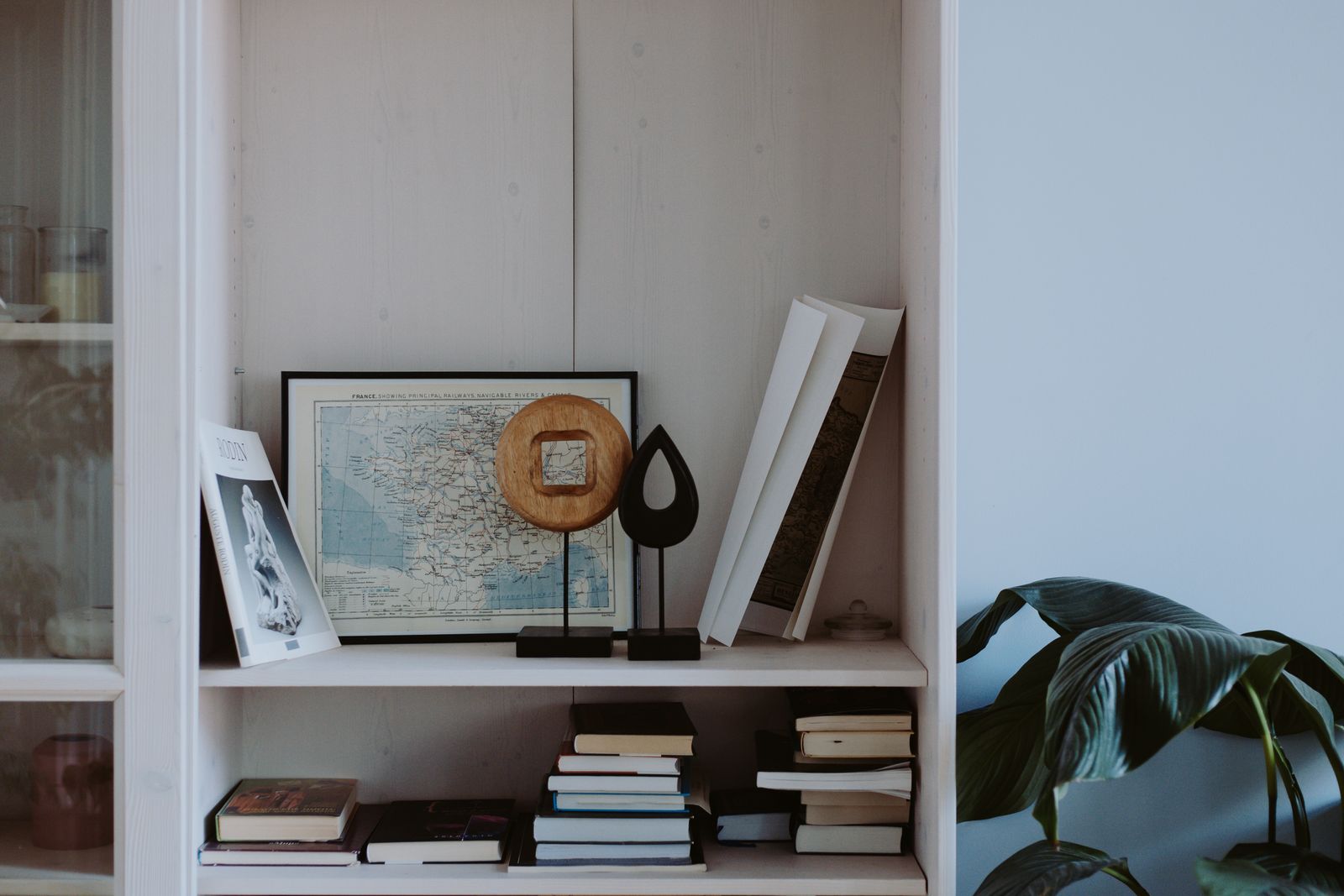
Photo: cottonbro studio / Pexels
Leave negative space
The most common styling mistake is filling every square centimetre. Leave space above groups, at the ends of shelves and between objects. Empty space is what makes the objects you have chosen look deliberate. If a shelf feels crowded, remove one thing and see how the rest improves.
A useful rule: each shelf should have one clear focal point and some breathing room around it. Two competing focal points on the same shelf will fight each other. If you have a large statement piece, give it a shelf almost to itself.
Mix vertical and horizontal
A shelf of all upright books looks like a library. A shelf of all stacks looks like a shop display. Combine both: a run of vertical books, a horizontal stack used as a pedestal, a leaning frame, a bowl. The changes in direction are what make the shelf interesting to look at.
Lean artwork or frames against the back of the shelf rather than hanging them. It adds depth and makes the display feel less formal. Make sure the frame is stable — a small museum putty or a hidden support stops it sliding when the shelf is bumped.
Repeat a material or colour
Repetition creates coherence. If you have a brass frame, add a small brass object elsewhere. If you have a lot of white ceramics, repeat that across two shelves. The eye likes to find the pattern. Without some repetition, a shelf reads as a collection of unrelated things.
Limit yourself to two or three materials across the whole unit. Wood and ceramic, or glass and brass, will look more intentional than a mix of ten finishes. Colour can work the same way: choose one accent colour and let it appear three or four times across the shelves.
Scale the objects to the shelf
A tiny object on a deep shelf disappears; a large object on a narrow shelf looks precarious. Match the scale of the objects to the shelf depth and height. On a deep shelf, use a taller piece at the back to create depth; on a shallow shelf, keep everything low and slim.
If a shelf is very deep, you can create a layered effect by placing a large, quiet object at the back and smaller, more detailed objects in front. Just make sure the front objects do not hide the back ones entirely.
Use lighting to add depth
A small battery-powered picture light or a clip-on spotlight can transform a shelf. Light raking across objects creates shadows and makes the display look three-dimensional. Warm white light is essential; a cool white LED on a bookshelf looks like a shop fridge.
If you have built-in shelves, consider a subtle LED strip along the underside of one or two shelves. It is a small intervention that makes the whole unit feel custom.
Refresh the shelf seasonally
A shelf does not have to stay the same all year. Changing three or four objects with the season keeps the arrangement interesting without requiring a new purchase. In autumn, add a wooden bowl, a candle and a few darker spines. In spring, swap in a small vase, a lighter ceramic and something green. The structure — books, anchor object, negative space — stays the same; only the details move.
This is also a useful way to rotate the things you own. Objects that have been in a cupboard for months feel new when they reappear on a shelf, and the shelf itself feels fresher without any additional spending.
Style for the room, not the photograph
A shelf in a living room can carry more objects than a shelf in a bedroom. A kitchen shelf needs to survive steam and grease. A child's room needs lower shelves that can be reached. Style the shelf for how the room is actually used, then photograph it if you like. The lived-in version will always look better in person.
And when in doubt, take one thing off. The shelf will almost always improve.