
Choosing a wall colour from a small paper swatch is the most common decorating mistake in existence. Paint changes with light, with the floor, and with whatever is next to it. A colour that looks like a soft warm white in the shop can turn lilac in a north-facing room and green under a tree canopy. A little patience here saves a whole weekend of repainting.
Paint is also one of the cheapest ways to change a room. Getting it right is less about taste than about process: understand undertones, test on the wall, and choose a finish that suits the surface.
Understand undertones
Every colour has an undertone — the subtle hue underneath the main one. Whites are rarely pure; they lean warm (yellow, pink, cream) or cool (blue, grey, green). Greys are almost never neutral; they carry a hint of blue, green, brown or violet. A "greige" can read warm in one room and cold in another.
The practical consequence is that you cannot match a paint to a fabric or a floor by name alone. You have to compare the actual samples in the actual room. Two paints both called "warm white" can look completely different side by side.
Test on the wall, not on paper
Paint a large square — at least A3, ideally bigger — directly onto the wall in two or three places, including a corner and an area near the window. Leave it for at least 24 hours and look at it in the morning, in the afternoon and at night with the lamps on. Paint a second coat so the sample is the true colour.
Paper swatches are too small and too reflective. Even a large paper sample held against the wall will not show how the colour behaves on a textured surface in your light. If you cannot paint directly on the wall, paint large sheets of lining paper and tape them up — but still test several positions.
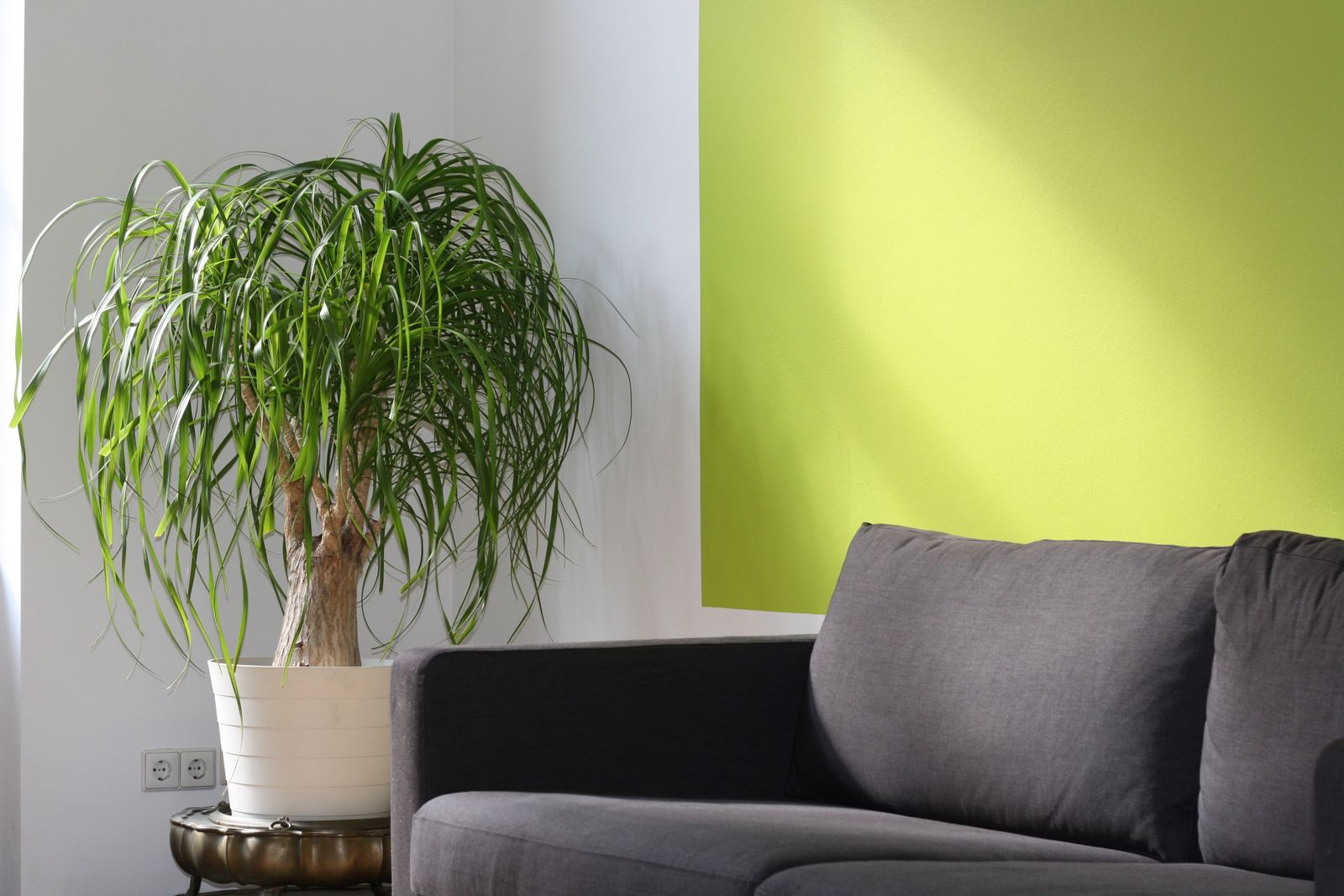
Photo: Pixabay / Pexels
Consider the direction of the light
North-facing rooms receive cool, indirect light and tend to make cool colours look colder and warm colours look muddy. In these rooms, warmer whites and soft greiges usually work better. South-facing rooms get warm, direct light and can carry cooler colours without feeling bleak. East light is warm in the morning and cool in the afternoon; west light is the reverse.
Also look at what the light bounces off: a green garden, a red brick wall, a grey street. The room does not exist in isolation. A white wall next to a large green tree can pick up a green cast during the day, especially in summer.
Understand light reflectance value
Every paint colour has a light reflectance value (LRV), a number from 0 (black) to 100 (white) that describes how much light it reflects. In a dark room, a colour with a higher LRV will bounce more light around and make the space feel brighter. In a very bright room, a lower LRV can reduce glare and add depth.
You do not need to memorise the number, but it is a useful tie-breaker between two similar colours. If one is noticeably lighter, it will feel different in a small or dark room even if the swatches look almost identical.
Choose the right sheen
Finish matters as much as colour. Matte and flat finishes hide imperfections and look sophisticated, but they are harder to clean. Eggshell is a good middle ground for walls: washable but not shiny. Satin and semi-gloss are more durable and easier to wipe, which makes them suitable for kitchens, bathrooms, trim and doors.
High-gloss walls are a design statement, but they highlight every lump and crack in the plaster. If the walls are not in good condition, choose matte or eggshell.
Match the trim and ceiling deliberately
Bright white trim against a warm wall can look crisp, but in an older house it may be too stark. Off-white trim is softer. Ceilings do not have to be brilliant white; a slightly warmer white can make a room feel calmer and less clinical.
If you are painting a small room, consider painting the ceiling the same colour as the walls, or one shade lighter. The continuous colour blurs the edges of the room and makes it feel larger. In a room with beautiful cornices, a white ceiling keeps the architecture crisp.
Use the 60-30-10 rule loosely
A common guideline is 60 percent dominant colour, 30 percent secondary, 10 percent accent. In practice, this means the walls and large furniture carry most of the colour, textiles and smaller pieces support it, and a few objects provide contrast. It is a useful sanity check, not a formula.
Remember that the floor and the largest pieces of furniture are part of the palette. A warm oak floor will make a cool grey wall look cooler; a dark rug will make a pale wall look brighter. Paint is never the only colour in the room.
Prepare properly and buy enough paint
Most paint failures are preparation failures. Fill cracks, sand glossy surfaces, clean grease from kitchen walls and use a primer where the existing paint is dark or the surface is porous. Two coats of a good paint will usually cover better than one thick coat of a cheap one.
Estimate the quantity before you start. One litre covers roughly 10–12 square metres per coat on a smooth surface, less on textured walls. Buying a little extra avoids the risk of a slightly different batch colour halfway through a wall.
Plan the colour flow between rooms
Paint does not stop at the doorway. In an open-plan space, adjoining walls are visible from every angle, so colours need to relate to each other. A warm white in the living room and a cool white in the hallway can look jarring where the two meet, even if each works on its own.
A simple approach is to choose one whole-house neutral and use stronger colours in rooms that can be closed off, such as a bedroom or a study. If you want different colours in open-plan rooms, keep them in the same temperature family and repeat at least one element — a trim colour, a ceiling white, a single accent — so the transition reads as deliberate.
Carry samples from room to room rather than judging each colour in isolation. The eye compares adjacent surfaces constantly, and a colour that looks perfect in the bedroom may look muddy when seen from the living room.
Live with it before you commit
Sample pots are cheap. A full tin is not, and neither is the labour of painting a room twice. Choose two or three candidates, test them on the wall, live with them for a few days, and then commit. The colour you choose at the end will almost certainly be the one you were least excited about at the start — and that is usually a good sign.